Ghirardelli opened a new ice cream and chocolate shop in Las Vegas in May last year. Across from Caesars Palace, it’s part of the new open-air, pedestrian-friendly, retail, dining and entertainment mixed-use district known as the LINQ and anchored by the High Roller observation wheel. Yes, the anchor is a Ferris wheel. Only in Vegas!
When Ghirardelli hired Field Paoli to design this space, there was a list of preferred finishes and we were asked create a location that was both ice cream shop and retail store within a relatively small footprint of 1,500 square feet. That’s not much room to fit seating for customers, a retail area for chocolates and related merchandise, and space for the servery, where sundaes, espressos and Ghirardelli hot cocoas are prepared. However, the resulting design has now become Ghirardelli’s brand for new stores.
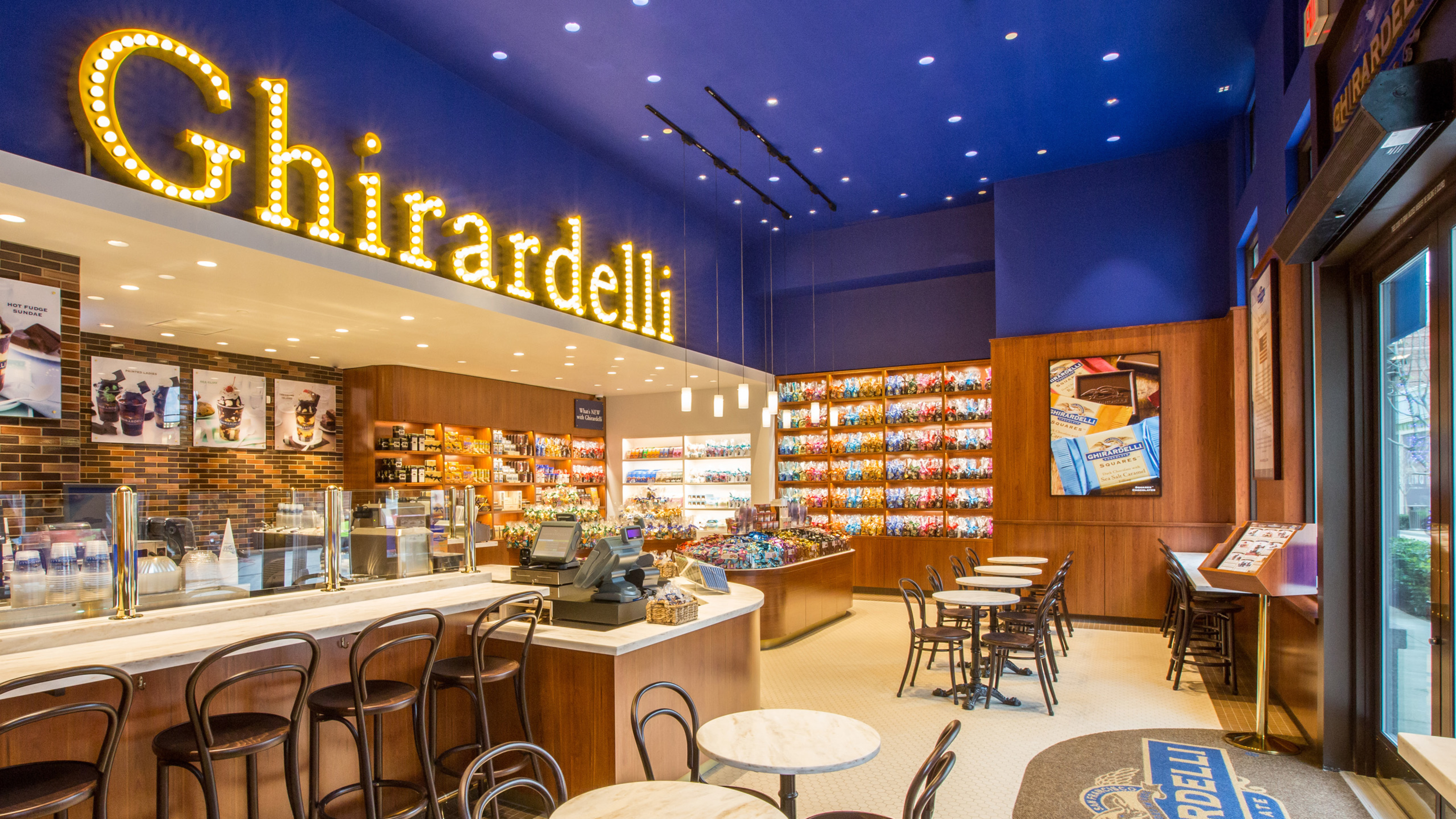
The company’s famous home in San Francisco at Ghirardelli Square was a key touchstone for the design. The trademark sign spelling out “Ghirardelli” in brilliant light bulbs was visible to ships passing through the Golden Gate since the early 1900s. This iconic sign was crucial to the store branding. However, incorporating such a sign became questionable at the LINQ; the tenant sign criteria prohibited parapet signs.
We presented the proposed design to the landlord, Caesars Entertainment, and requested a variance. The sign’s placement on the parapet is part of the brand icon, a part of the San Francisco skyline and, well, it ought to be part of the LINQ’s Vegas skyline. After consideration, Caesars gave the thumbs up—after all, Vegas does have a history of iconic signage (“Welcome to Fabulous Las Vegas”) and is home to the Neon Museum and its Neon Boneyard, which features an extensive collection of “rescued” casino signs. The letters of the Ghirardelli sign sit six feet tall and span the full width of the store, giving Ghirardelli’s 1,500 square foot ice cream shop a true Vegas-style presence. What a huge difference. Folks riding the High Roller can spot it immediately and know exactly where to go for a sundae in hot Vegas weather.
In addition to the exterior parapet bulb sign, Yvo Smit, Ghirardelli’s vice president of restaurant and retail, also urged the team to integrate a Ghirardelli bulb sign indoors, which surprisingly has not been part of Ghirardelli’s store brand. It was important to consider the appropriate placement and to do it at the right scale so it would retain its prominence without being overwhelming.

A related piece of the design came about through a kind of happy accident. Upon a follow up site visit, we discovered that several 10″ diameter chiller pipes running horizontally across the back third of the space had been installed as part of the shell building. What confronted us was that while the underside of structure was 16′ up, the bottom of these chiller pipes was a scant 10′-6″ above finished floor.
It was an easy matter to conceal the pipes within a soffit. However this new volume became a dominant presence in the space, reducing a third of the retail ceiling height to 10′ clear. After some design studies, the soffit became a driver of the design and a clean, creamy white “box within a box” was conceived. The overall “box” was the 16′ high Ghirardelli blue ceiling. The smaller box formed by the low soffit to conceal the chiller pipes was painted “Vanilla Milkshake” white at 10′. Incorporating walls and painting them the same color created the sides of the box. It created an intimately upscale space for specialty retailing. The bulkhead above the soffit became the perfect place for the interior Ghirardelli bulb sign.
White became the accent color set in the field of rich, warm cherry wood millwork. The space transformed into an architectural metaphor for the Ghirardelli sundae, made complete with both traditional and contemporary accents. The Ghirardelli blue ceiling is studded with recessed downlights, creating the look of a starry night sky, a cool element to balance the warm tones.

In developing the design, a few additional elements were added to Ghirardelli’s mix of finishes, such as a collage of colored wall tiles by Fireclay Tile. The tile selection of colors “Cinnabar,” “Burnt Umber,” and “Chestnut” was used to accent the wall behind the servery. This provided a rich visual texture reminiscent of different grades and flavors of chocolate and serves as the backdrop for marketing imagery.

Another element is a white “Witch Hazel” Corian for the counters in the servery instead of the typical stainless steel, as this area is visible to the public and often part of the “attraction.” Use of clean contemporary-styled pendant lights accent select merchandising such as the Pick ’n Mix, a hugely popular feature. The concept is simple: grab a cellophane bag and fill it with any mixture of Ghirardelli’s chocolate squares to your heart’s desire. Get a little “Sea Salt Soiree” in with “Peppermint Bark,” a handful of “Toffee Crunch,” “Pumpkin Spice,” and “Limited Edition Eggnog” squares. And, of course, who can pass up the Intense Dark 60% Cacao “Evening Dream”?
The man who originally founded the company, Domenico Ghirardelli, was born in Italy and set up his first coffee and chocolate shop in South America. It was the 1849 Gold Rush that brought him to California, where he ended up in Stockton selling confections from a tent to fellow prospectors. So it’s only appropriate that today, there’s a Ghirardelli store available to Las Vegas’s gold-seekers. You may or may not strike it rich on the roulette table, but you can always count on a delectable hot fudge sundae.
These design moves—the interior light bulb sign, the creamy white “box within a box,” the coffee espresso wall tile, and the Ghirardelli blue ceiling—are now part of Ghirardelli’s new store branding and incorporated into new stores following Vegas, including the newest store at Boston’s Faneuil Hall, which we designed and which opened in late October, and the forthcoming store we’re creating for Ghirardelli in Chicago’s Wrigley Building.

Related Articles